
Why Consistency Matters
A strong brand isn’t just about having a logo. It is about showing up consistently across every touchpoint: your website, social media, packaging, proposals, and even your email signature.
When your look and tone are consistent, three things happen:
You build trust because people recognise you instantly and feel confident buying from you.
You save time because you don’t reinvent your visuals or voice every time you create content.
You look professional. Even if you are a one-person business, consistency makes you appear established.
This is why you need a brand style guide.
What Is a Brand Style Guide?
A brand style guide is a simple document that defines the rules for how your brand looks and sounds. Think of it as your brand’s rulebook.
It doesn’t have to be a 40-page corporate document. For most small businesses, a 2–5 page style guide is enough to keep everything aligned.
Your style guide should cover both visual identity (colours, fonts, imagery, logos) and, ideally, your verbal identity (voice and tone).
The Core Elements of a Brand Style Guide
1. Colour Palette
Your colours are one of the strongest signals of your brand identity. Limit yourself to a small set:
Primary colours: 2–3 core brand colours
Secondary colours: 1–2 neutrals or accents
Always include exact codes: HEX for web, CMYK for print, and RGB for digital.
Example:
Primary: Deep blue (#003366), Aqua (#00AEEF)
Neutral: Light grey (#F5F5F5), Charcoal (#333333)
Tip: Test your colours for accessibility. Text should always have enough contrast to be easy to read.
2. Typography
Typography sets the tone of your brand’s personality. Clean, consistent fonts make your brand more polished.
Headline font: bold and distinctive but easy to read
Body font: simple and legible on screen and in print
Fallbacks: system fonts as backups for web use
Example:
Headline: Playfair Display (serif)
Body: Lato (sans-serif)
Keep to a maximum of two font families to avoid clutter.
3. Imagery
Images are powerful mood-setters. Decide on a clear style so your brand visuals always feel consistent.
Ask yourself:
Do we use photography or illustration?
Are images light and airy, bold and colourful, or dark and moody?
Do we prefer candid, natural shots or polished studio photography?
Examples:
A wellness brand may use bright, natural, minimalist photos.
A law firm may use professional, muted, confident photography.
Avoid generic stock photos. If you must use them, choose ones that feel authentic.
4. Logo Use
Your logo is your anchor. A style guide should cover:
Primary logo (the main version)
Alternative versions (monochrome, reversed, icon-only)
Spacing rules (how much space to leave around it)
Minimum size (to keep it legible)
Don’ts (stretching, changing colours, adding shadows)
Tip: Show visual examples of correct and incorrect use.
5. Voice and Tone (optional but powerful)
Your style guide doesn’t need to stop at visuals. Adding a section on voice and tone ensures your brand sounds the same everywhere.
Decide on 3–4 tone words that describe your communication style.
Examples:
Supportive, clear, motivating, approachable
Bold, confident, witty, direct
Professional, authoritative, calm, trustworthy
If visuals are the face of your brand, voice is the personality.
How to Create a Simple Style Guide
Start with a blank document or Canva template.
Add your logo, colour palette with codes, and fonts.
Write one or two paragraphs about your imagery style.
Add logo rules and usage examples.
(Optional) Write 3–4 tone words and sample text snippets.
Even this simple version will give you a professional foundation.
Example: What a 3-Page Style Guide Might Include
Page 1: Logo, colours with HEX codes, and fonts
Page 2: Image style examples, do’s and don’ts
Page 3: Voice and tone words with a sample sentence
That’s enough to brief a designer, social media manager, or copywriter, and keep your brand looking and sounding consistent.
Checklist: Does Your Style Guide Work?
✅ Does it include a clear colour palette with exact codes?
✅ Have you chosen only one or two fonts for consistency?
✅ Do you have clear logo rules and don’ts?
✅ Is your imagery style defined?
✅ Is your voice and tone consistent with your brand personality?
Key Takeaway
A brand style guide is your shortcut to a consistent, professional identity. It doesn’t need to be complex. Even a short, clear document makes your brand stronger and saves you endless time and confusion later.
Go further
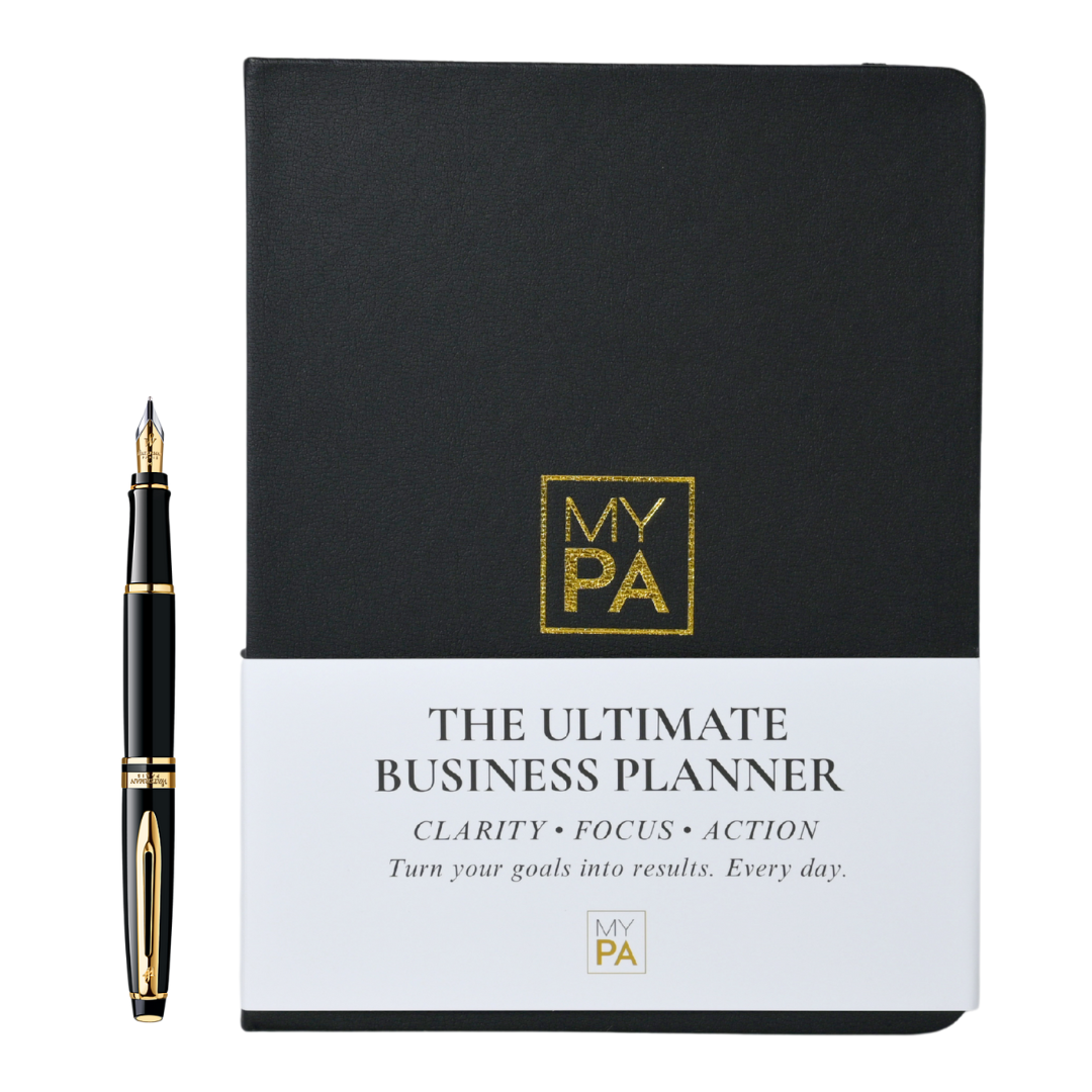
Need more than a one-pager?
MY PA Business Planner (physical & digital) helps you plan weekly, track goals, and stay accountable.
See the Planner
Ready for the complete system?
The Business Starter Kit bundles the planner with templates, financial tools, and a 30-day roadmap.
Explore the Starter Kit
Raising funding?
Get investor-ready with structured planning, forecasts and checklists. (Investor Kit link set to Starter Kit as requested.)
See Investor Kit